Analytic Dashboard
Please consider that the chart data is presented in UTC-0, not considering your time zone shift.
This tab contains some basic analytic information about the daily and weekly quality of your traffic.
To get the data:
Select the website;
Indicate time period (day, week, or a custom time frame);
After you indicate the required parameters, the system will display the chart that shows the volume of your traffic and the quality of your users. They are divided into 3 categories:
Green area – 0-50 Fraud Score (Quality users).
Orange area – 51-75 Fraud Score (Low-risk users).
Red area – 76-100 Fraud Score (Potential Fraudsters).
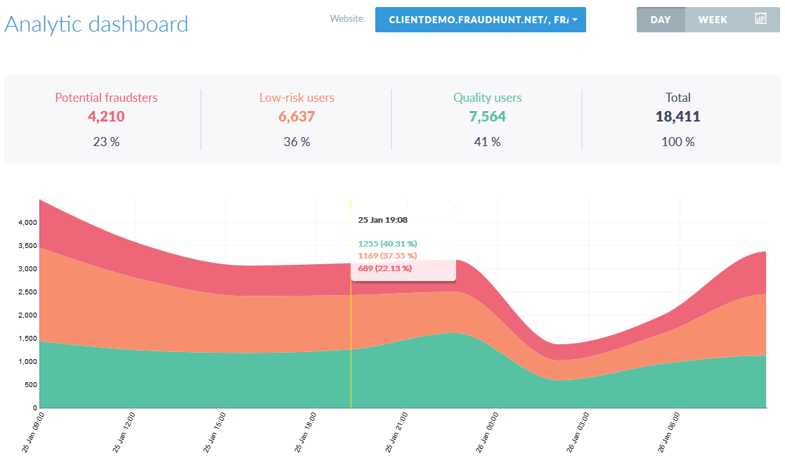
The chart contains information about the number of users (Y axis) and a time limit (X axis).
Placing your cursor at any point of the chart will display information about a number of users in each category at a given time and their percentage.
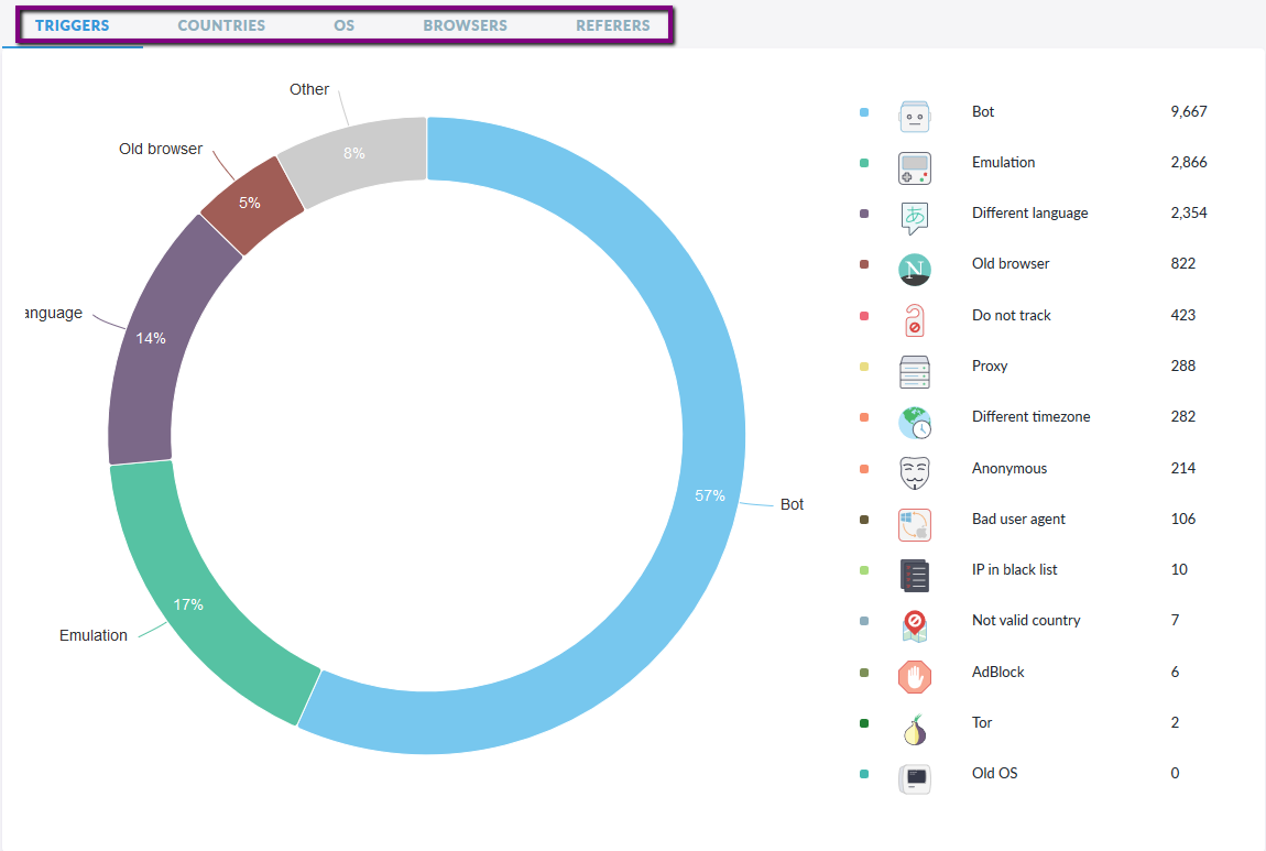
Data can be filtered by:
Triggers;
Countries;
Operating Systems;
Browsers;
Referrers;